
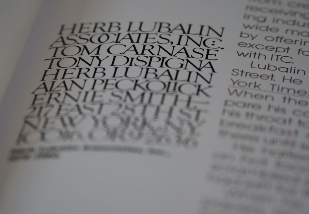
Accessible design involves making your content as readable as possible for those with visual impairments, neurodiversity, and other difficulties. During accessibility testing, every choice you make is important—even the typeface you select. Accessible fonts benefit all users, as some typefaces are challenging to read, even for people without neurological or vision problems. Accessible typefaces shouldn’t have anything that reduces the font’s effectiveness, slows users down or makes distinguishing between letters harder.
This blog looks at why accessible fonts are important and how to incorporate them.
Dyslexia-friendly Fonts
Reading is difficult for people with dyslexia because they find it hard to detect speech sounds and understand how they relate to letters and words. Businesses have created dyslexia-friendly fonts to make reading easier for people with the condition. The letters in these typefaces can be slanted, have thicker lines in specific sections, and have different-length sticks and tails on the letters (b, d, and p).
Use standard sans serif fonts if your website doesn’t already have dyslexia-friendly fonts. It has been found that while sans serif, monospaced, and roman fonts help people with dyslexia read more easily, italic typefaces make text more difficult to interpret. Helvetica, Courier, Arial, Verdana, and CMU are a few suggested typefaces for those who have dyslexia.
How To Select Accessible Fonts
When choosing accessible fonts, it is important to remember that increasing the text is often possible to make the letters appear more distinct. Depending on how information is displayed, the font design’s accessibility may be increased or decreased. Here are some guidelines for making visual content accessible:
- Use lists with bullets and succinct, straightforward language like this one.
- Use easily understandable icons.
- Avoid unnecessary visual clutter, such as complex backgrounds or conflicting colour palettes.
- Avoid small print
- Use large, clear headings to divide the content into sections.
While designing for accessibility, using just one typeface or a small number of fonts is preferable. With this strategy, readers who have trouble reading text can take in your content without paying attention to how the letters appear.
Accessible Fonts
There are several fonts, including serif and sans serif alternatives, that will function with a variety of design types while also being appropriate for accessibility. These include Helvetica, Calibri, Tahoma, Museo Slab, Source Sans Pro, Arial, Times New Roman, Rockwell, and Roboto Slab.
Stylistic Design are passionate about design and style, ensuring every customer gets professional creativity that delivers. Contact our friendly team for more information about our services.


