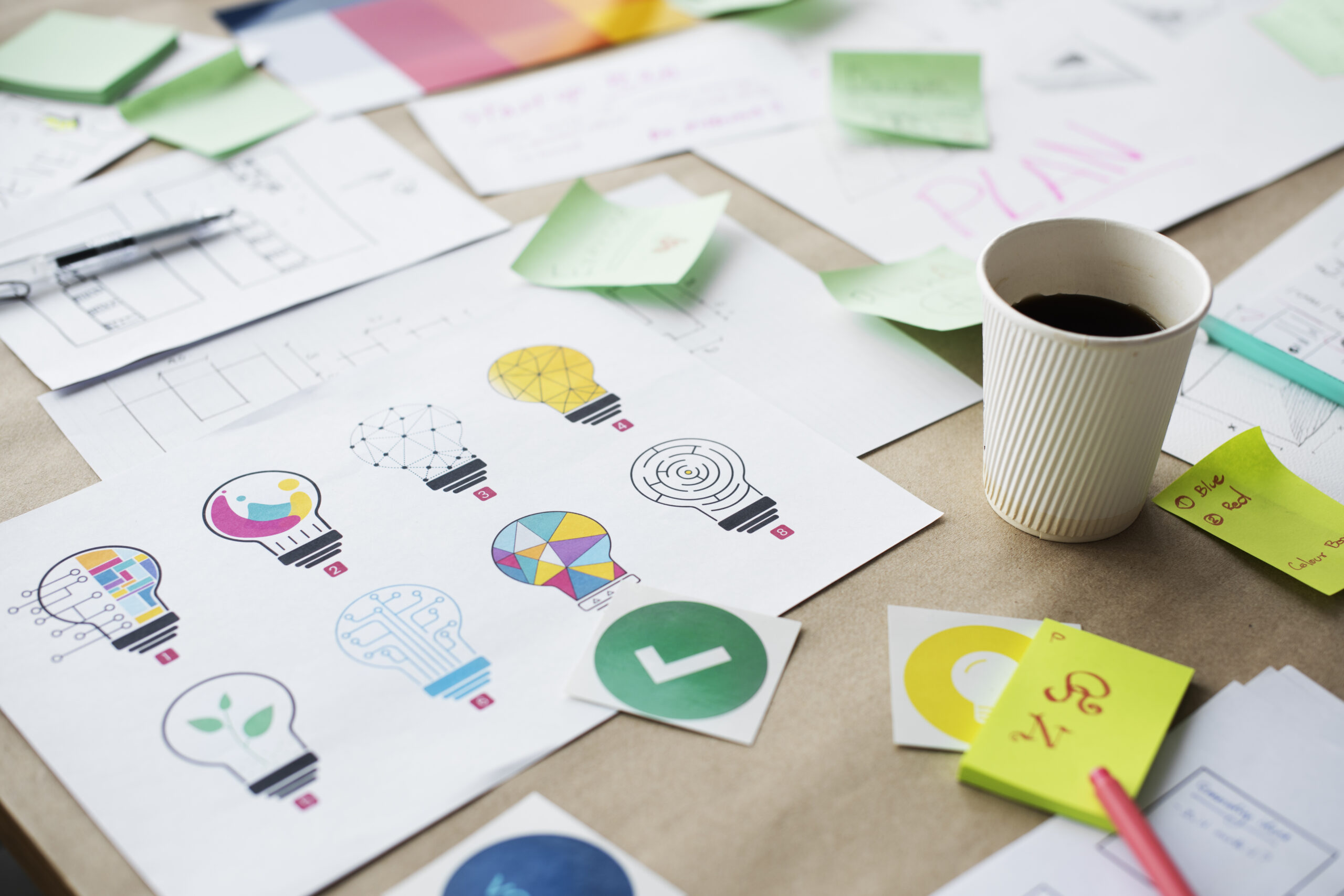
A logo is a visual representation of a company essential to building recognition and brand identification. Creating a logo for digital platforms is crucial in today’s digital environment. Here, we look at the do’s and don’t’s of digital logo design.
Logo Checklist
When creating your digital logo, bear the following tips in mind:
Do’s
- Less can be more. A straightforward logo is simpler to recall and identify. Don’t use too many components, colours, or typefaces.
- Make it adaptable. Your logo should appear great across various contexts and sizes, from big banners to tiny icons.
- Make good use of the negative space. Your logo will look more balanced and appealing when it has negative space.
- Select a colour scheme that works well with your brand. Colours can elicit various emotions, so pick hues consistent with the essence of your business.
- Verify that your logo can be scaled. You should be able to adjust the size of your logo without sacrificing its quality.
- Make use of a formal font. A professional typeface can give your logo a more refined and finished appearance.
- Seek input from other people. Consult your friends, relatives, and co-workers about their opinions about your logo.
- Think about who your target market is. What sort of impact are you hoping to have on your intended audience?
- Maintain the integrity of your brand identity. Your brand’s overall messaging and visual identity should be reflected in your logo.
- Seek expert assistance as necessary. Consider working with a professional graphic designer, such as Stylistic Design, if you lack confidence in your creative abilities.
Don’t’s
- Apply clipart. Clip art is frequently used carelessly and excessively.
- Overuse the fonts. Your logo may appear busy and confusing if it has too many fonts.
- Don’t use too many colours. Using too many colours in your logo may make it confusing and difficult to remember.
- Don’t make your logo overly complex. At small sizes, a detailed logo may be hard to discern.
- Opt for drop shadows. Drop shadows have the potential to age your logo.
- Redesign your logo annually. Your logo ought to be durable and ageless. Change your logo only if it is outdated or no longer accurately reflects your company.
Stylistic Design are passionate about effective design that enhances brand recognition and strength. Our bespoke services incorporate innovative design techniques to deliver the best service. Contact our friendly team for information about our services.